Overview · CNA Pro
Pro tool
Build Coverage Map
Paint a colour-coded picture of signal strength as you walk or drive, then drape it over Google Earth.
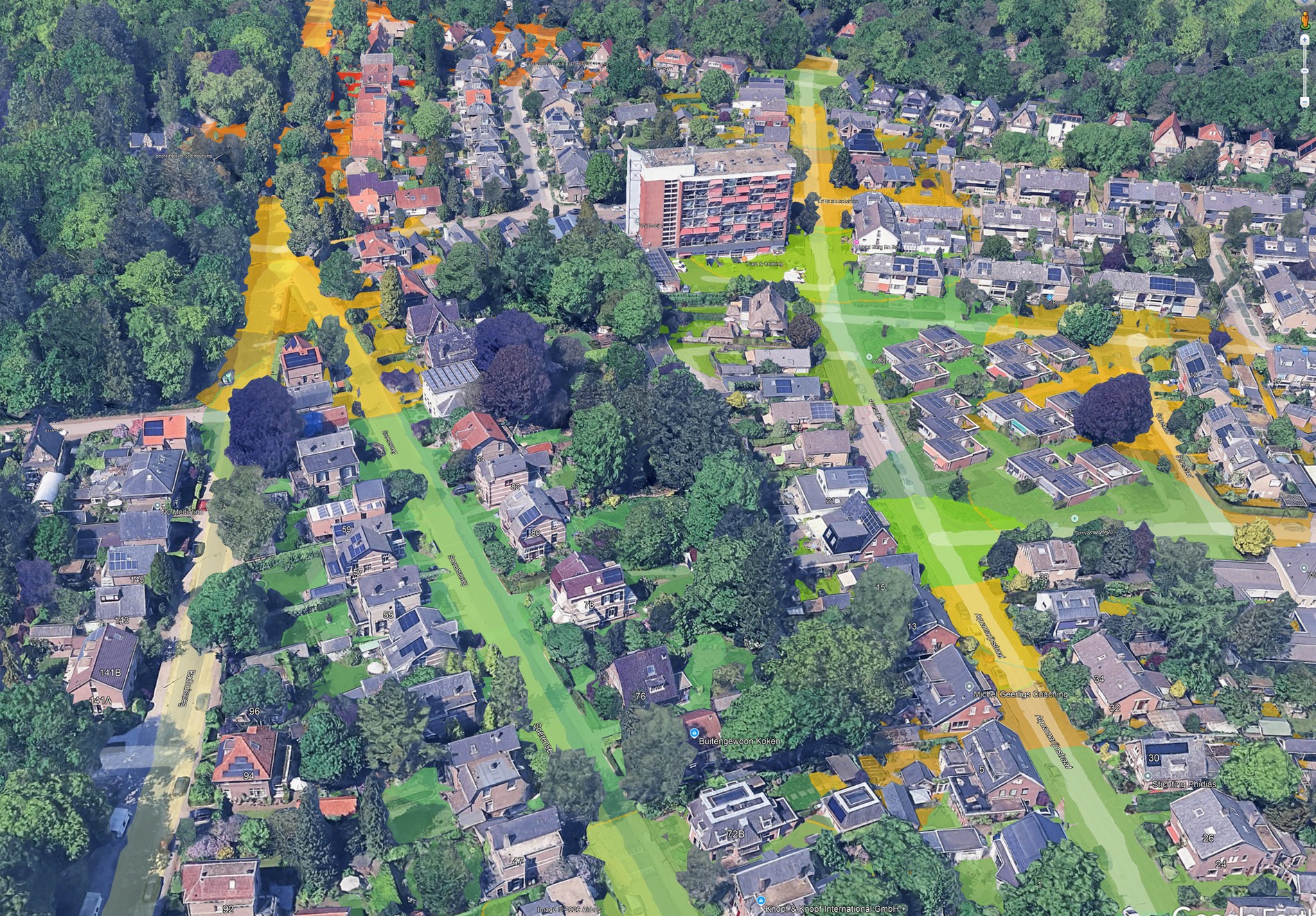
Paint a colour-coded picture of signal strength as you walk or drive, then drape it over Google Earth.
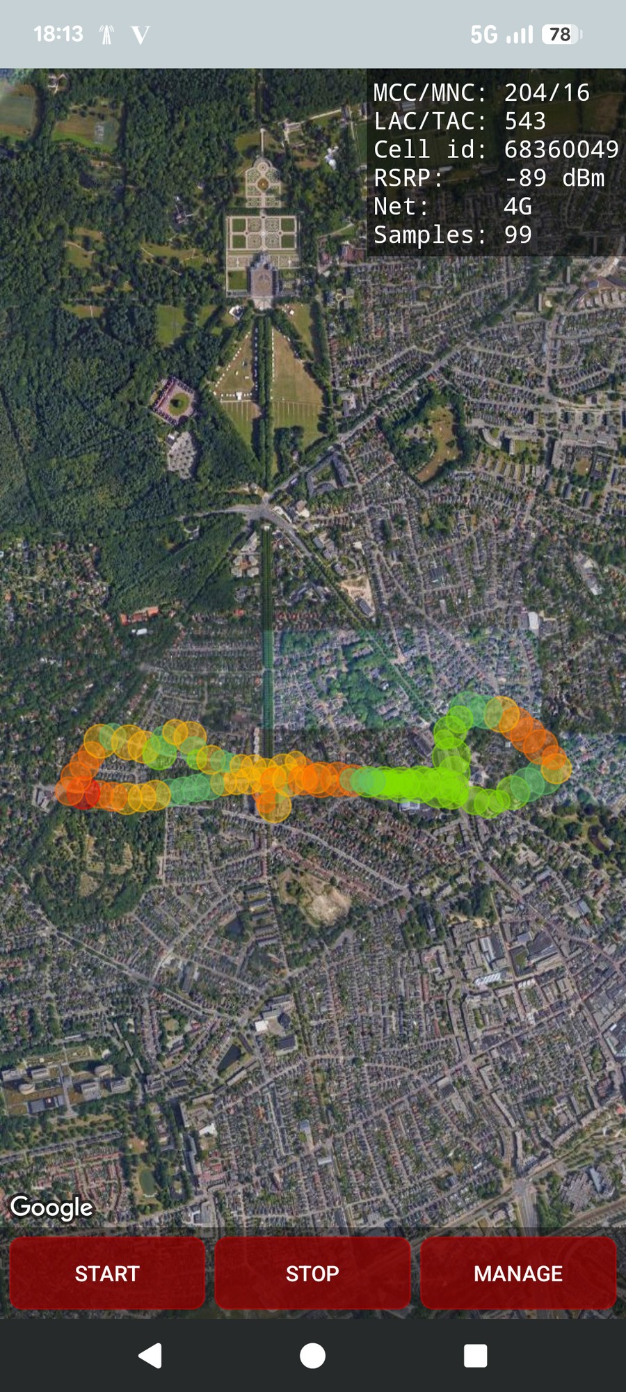
Open Build Coverage Map and press START. CNA samples the serving-cell signal every few seconds and drops a colour-coded circle at your position; its radius grows with the distance you have moved, so faster stretches get larger circles. Press STOP to finish, or let the safeguard duration end it. MANAGE opens your saved maps.
The panel top-right shows the live sample: operator, cell id, current RSRP, network type and the running sample count.
Coverage mapping runs as its own background service, so you can lock the screen or switch apps and it keeps sampling; it can also run in parallel with route logging and a tower hunt at the same time.
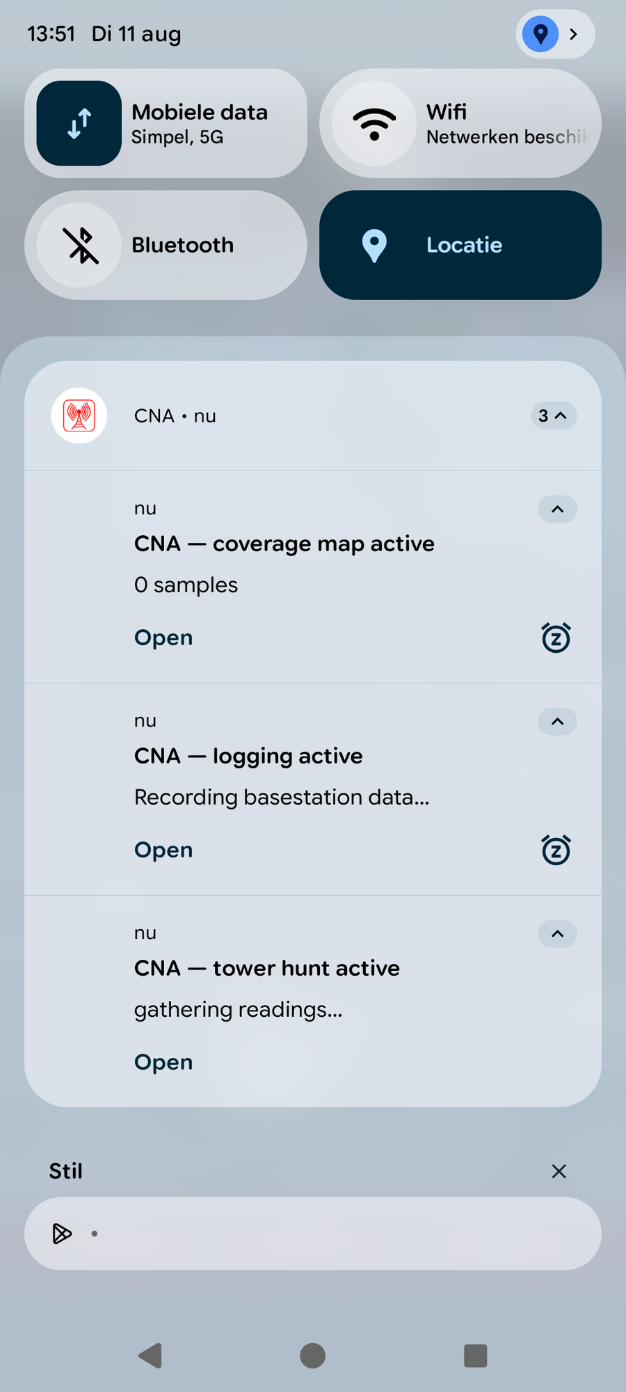
Because each tool is a separate foreground service, CNA can record a coverage map, a route log and a tower hunt simultaneously. Android shows one ongoing notification per active tool, each with an Open action. Stopping is always done from the tool's own screen.
Tap any circle, on the phone or in the exported KMZ, to open its full detail. The RSRP is shown large at the top, followed by the complete snapshot for that sample.
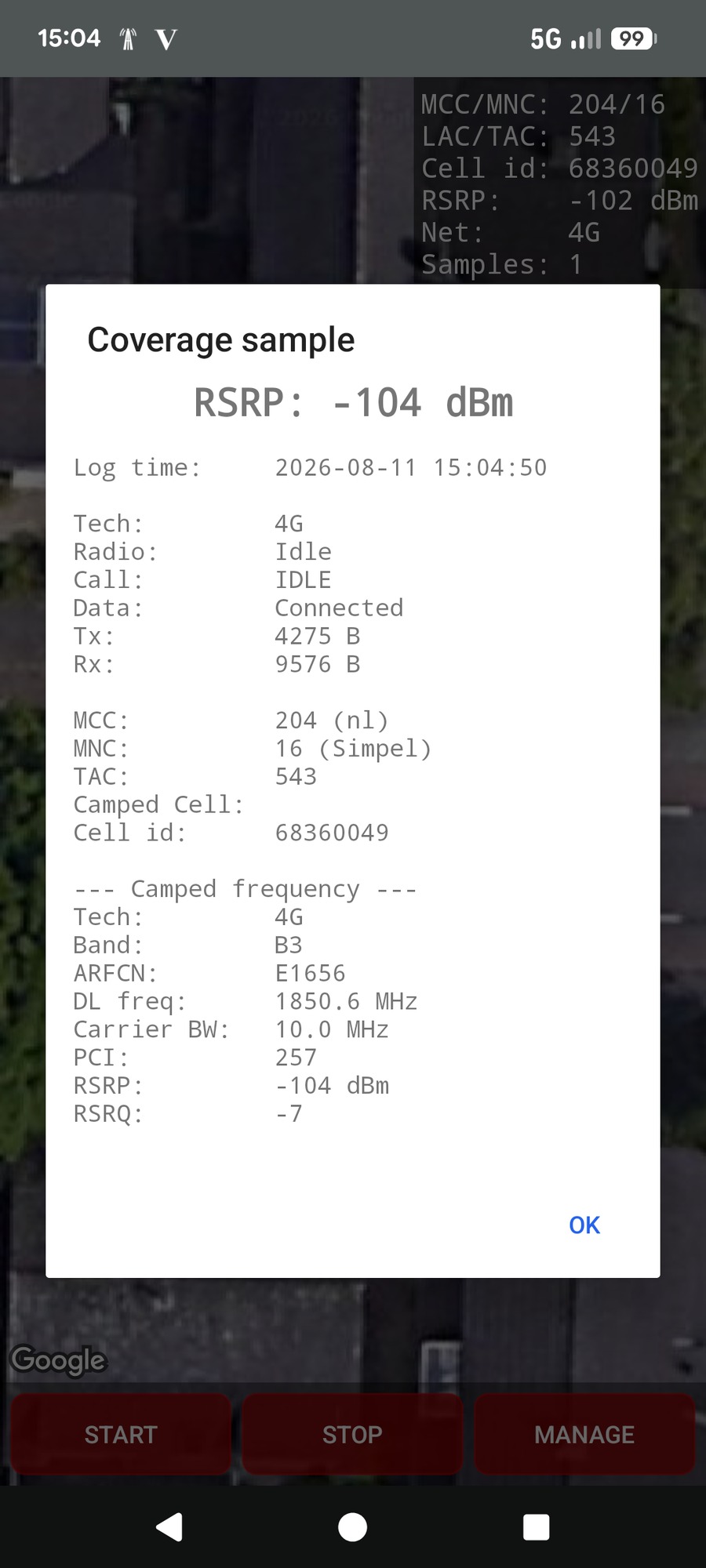
The popup gathers the fields explained on the Geographical and Spectrum pages into one place for that exact spot:
Circles are coloured on the same weak-to-strong ramp used throughout CNA.
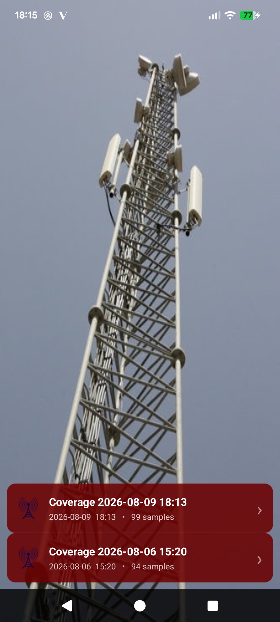
Every finished map is saved to a list (up to 10). Tap one to open its options:
RSRP (signal strength) tells you how much signal reaches your phone. But a cell can be strong and still perform poorly if it is congested or suffering interference from neighbouring cells. RSRQ (signal quality) captures that: it factors in interference and load, so it often reveals problems that a strong RSRP hides.
That is why CNA lets you export the very same coverage map two ways, coloured by RSRP and coloured by RSRQ. Comparing the two Google Earth overlays quickly shows spots where the signal looks strong but the quality, and therefore your real-world throughput, is not.
The CSV export is one row per sample, so you can filter, average and chart your coverage in a spreadsheet. It uses a semicolon as the delimiter (not a comma), so choose that delimiter when opening it. Every column is one of the parameters already explained above:
A coverage map follows only the serving (primary) carrier, so there are no secondary-carrier columns; for the full multi-carrier layout see the Route Logging CSV.
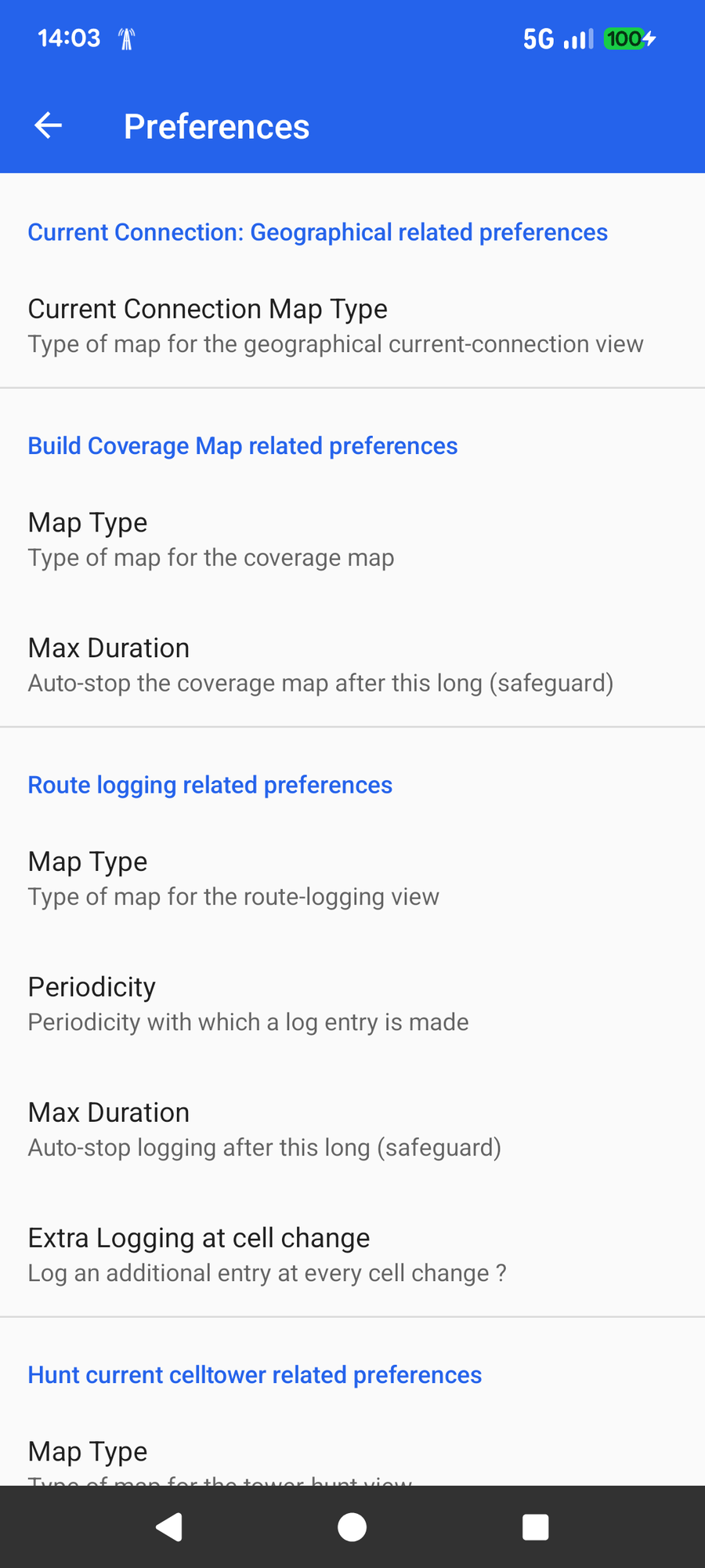
Under Build Coverage Map related preferences you can set:
Where the coverage map paints signal strength, route logging records the full tower connection at each point, and links every position to the tower it was using.
📍 Open the Route Logging guide